VOLUME 3: Table of Contents
TEACHING ISSUES AND EXPERIMENTS IN ECOLOGY
TEACHING
ALL VOLUMES
SUBMIT WORK
SEARCH

ISSUES: DATA SETS
STUDENT INSTRUCTIONS
Objectives of this Project
As you create figures using the data provided, and answer questions throughout the exercise, keep the following three objectives in mind:
- Increase your understanding of ecological interactions and the response of plant productivity to fire, topographical position, and climate in the tallgrass prairie.
- Learn to make and interpret figures describing ecological interactions and ecosystem functioning.
- Based on this understanding of ecosystem functioning, predict the responses of tallgrass prairie plant productivity to a variety of climate and fire treatment conditions.
Long-term datasets provide an invaluable tool to monitor, study, and understand the changes occurring within an ecosystem over time. Using long-term experiments and datasets, ecologists can identify patterns and processes that would not be otherwise be apparent in studies conducted over a single year. In this exercise, you will work with data from an area representing the largest remaining unplowed tallgrass prairie in North America. The data come from the Konza Prairie Biological Station (KPBS), a Long Term Ecological Research (LTER) site in Kansas. KPBS contains rolling hills covered in an expanse of grasses and wildflowers. During years of average or above-average rainfall, the dominant grasses can grow 2-3 meters high and are so dense as to get lost in while walking through. Woody shrubs coexist on the upland prairie sites, and lowland regions adjacent to streams contain large gallery oak forests. Bison, white-tailed deer, and turkey are the most common and conspicuous animals present, but a diverse array of mammals, birds, reptiles, fish, and invertebrates all inhabit KPBS.
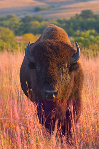
Bison on Konza Prairie
Copyrighted by: Judd Patterson
full size image
Many factors interact to influence plant growth in the tallgrass prairie. Due to the variability of the Midwestern continental climate, you will compare the yearly changes in the amount of precipitation with the rate of growth for grasses and forbs using a 16-year dataset of plant productivity. Fire is a common occurrence in these grasslands, and another important factor determining the growth and type of prairie vegetation. Therefore, you will compare plant productivity data in areas that have been burned every year or burned less frequently (at 4 year and 20 year intervals). A final factor influencing prairie productivity is soil depth and type, which varies with topography. On KPBS, the soils of upland sites are thin and rocky, while the lowland sites have deeper soil that is able to hold more moisture. At the completion of the lab, you should have a better understanding of how the influence of precipitation on productivity is, in turn, affected by interactions with fire and topography. Hopefully, you will appreciate why something that sounds simple — predicting the annual rate of prairie plant growth — can be quite difficult, especially if all the factors influencing growth are not included.
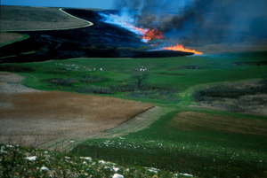
Fire Sweeping Across the Prairie
Photo by: Alan K. Knapp
full size image
Prairie Ecosystem Review
Historically, grasslands covered the middle third of the United States and were divided into three main types based on species composition and regional climate: tallgrass, mixed-grass, and shortgrass prairie. However, the fertile soils of the prairie were converted to row-crop agriculture and have also been used for grazing and urban development as European settlers domesticated the continent over the past 200 years. Of a grassland expanse that once spanned from Illinois to Kansas and Canada to Texas, only about 5% of the area once dominated by tallgrass prairie remains intact. Despite this enormous loss, few conservation and land management efforts are devoted to North American prairies. As a result, the area of native grasslands and uncultivated prairie continues to dwindle.
The prairie ecosystem is ideal for studying the response of terrestrial vegetation to natural climate variability and predicted future climate change. Because the vast majority of the plant biomass in the prairie is herbaceous, it is relatively easy to measure and record annual aboveground productivity and to recognize patterns and changes resulting from management and experimental manipulations. Trends and shifts in ecological pattern can be recognized in grasslands over periods of years compared to decades in slower-growing regions such as forests, tundra, and deserts. For this reason, datasets of only a couple decades can be a valuable tool for studying the response and recovery of vegetation to environmental perturbations (e.g., drought, fire, temperature changes).
Tallgrass Prairie Resource Limitations
Ecologists are interested in factors that limit plant production in an ecosystem — factors such as light, water, and nutrients that, when added, lead to greater rate of growth. Water limitations to productivity have been clearly documented in the drier shortgrass prairie (Lauenroth and Sala 1992), but the relationship between precipitation and productivity weakens at wetter (more mesic) prairie sites (Briggs and Knapp 1995). In mesic prairies, other factors can become limiting, and the amount of aboveground biomass produced in a given location is largely determined by the minimum of three potentially co-limiting resources: water, nutrients, and light (Schimel et al. 1991). Therefore, aboveground productivity can vary widely between consecutive years or within a year (Briggs and Knapp 1995). Working in Nebraska and Kansas during the intense droughts of the 1930s, the patriarch of grassland ecology, John Weaver stated: By 1941, seven years after drought began, these grasslands [tallgrass prairie] were almost entirely transformed into mixed prairie (Weaver 1943). Weavers pioneer research illustrated the defining role of rainfall and available soil water by documenting the replacement of a mesic plant community by more drought-tolerant species during dry periods. Therefore, while mesic prairies require all three resources in adequate supply, the strongest relationship between productivity and resource amount is with water availability, similar to the short and mixed-grass prairies (Knapp et al. 2001).
Generally, spatial differences in the landscape or management procedures that alter the local microclimate influence resource availability. Within a site, topographical differences may result in differing soil depth, water-holding capacity, and nutrient concentration all of which influence productivity and species composition (Briggs and Knapp 1995, 2001). Additionally, management practices such as the frequency of burning or grazing intensity can drastically alter plant resources. Annual burning volatilizes (converts to gaseous forms) nitrogen bound in dead biomass and can result in long-term nitrogen losses from the ecosystem (Blair et al. 1998). Annual burning also removes dead biomass, which increases soil temperature and the amount of light reaching the soil surface in the spring. Unburned prairies can accumulate large amounts of detritus, which results in cooler soil temperatures, greater soil moisture, and promotes the growth and success of cool-season plants (e.g., wildflowers, and other forbs and grasses) before temperatures increase to be optimal for the dominant warm-season grasses. In summary, to accurately predict plant productivity in the tallgrass prairie, you must include information characterizing the differences in topography, plant type (grasses and forbs), grazing, and fire frequency (Briggs and Knapp 1995).
Dataset 1
- In this dataset, productivity data over a 16-year time period (1984-1999) has been averaged. In addition, the variation surrounding that average (e.g., how much it varied from year to year) is expressed as the standard error (SE). The standard error of the average gives you an idea of how much variation to expect if you repeatedly took samples (e.g., if you went back in time, sampled grass production in a site, and did this again and again). The first question we will address with this dataset is: What is the effect of fire on grassland productivity? To get started, click on the Chart Wizard icon in the toolbar. The Chart type we will use is Column, and the Chart sub-type is Clustered Column.
- Click Next. You will need to highlight the Data range in the worksheet that you wish to plot. For this figure, we will keep it simple and compare Total Productivity between annually burned and 20-year burned prairie. Click the Collapse Dialog Button at the end of the Data Range box. You will now be able to select the data from the worksheet. Highlight the entire cell range to be plotted; in this case, the mean values for Total productivity for both burn types. Click the Collapse Dialog Button again to return to the Chart Wizard. You should now see two vertical bars, one for each burn type. Click Next, and label the chart and axes appropriately as well as customizing the figure. Click Finish when through.
- Looking at the figure youve just created, it is apparent that annually burned prairie has higher productivity than unburned prairie, but we have no way to assess the range of variability inherent to these two burn treatments. To add this information, you will need to add y-axis error bars. To begin, right click inside one of the bars, and select Format Data Series.... Click on the Y Error Bars tab. For the Display, select Both, and for the Error Amount click the Custom box. Use the Collapse Dialog Buttons as before to select the SEs associated with Total Productivity in Dataset 1. You will end up selecting the same data twice: once for the + box and once for the - box. Click OK. Based on this figure, anticipate what might occur in another 16 years. Discuss with your classmates.
- The figure of total productivity shows the difference between burned and unburned prairie, but do the different vegetation components (grasses and forbs) respond the same way to fire? To answer this question, you will create another column chart as before. However, instead of creating a separate figure for grasses and forbs, plot them in the same figure. When you reach the Source Data box, select the data range for one of the vegetation types. Then Click on the Series tab. You will now add a new series to the figure, in this case it will be the vegetation type not already selected. In the Values box, use the Collapse Dialog Button and select the mean values for either the grass or forbs (whichever one you havent already done). Now both vegetation types have bars over their respective fire frequency. Label and customize the figure as before. Additionally, you will need to add Y Error Bars for all four bars in the figure.
- Using the figure you just created answer the following questions.
- Are grasses and forbs equally productive within this prairie (i.e., does the contribution to total productivity differ by vegetation type?)?
- Do grasses and forbs respond similarly to fire? If not, how do they differ? Based on your understanding of how fire changes the local microsite, propose some possible explanations for why grasses and forbs differ in response to fire.
- Based on these data, what further questions do you have? What information would you need to address these questions? For example, you might have questions about monthly patterns of rainfall.
Dataset 2
Instead of presenting averages over the entire period, Dataset 2 provides annual values of productivity under a variety of conditions so that you can explore the relationship between fire and productivity in greater detail. In addition, total precipitation for each year is presented in order to examine the influence of water availability on productivity. For instance, if this ecosystem is water limited, years with higher rainfall should have higher productivity and vice versa. Use the Konza Data Set 2 Worksheet to organize your ideas and interpretations for the figures (graph) you will be making. Answer the questions for each figure you make on this worksheet. You will turn this worksheet in to be graded at the completion of the exercise.
- Figure 1: Because Kansas is a mid-continent site, weather patterns can differ widely from year to year. In order to assess the inter-annual variation in total precipitation, you will need to create a figure spanning the 16-year period. Using Chart Wizard again, select XY (Scatter) for the Chart Type and Scatter with data points connected by lines as the sub-type. For the data range, highlight both Year and Total Precipitation. Click Next and finish the figure as before. This figure displays how variable annual precipitation can be in this location (note: 1993 has almost three times more rainfall than 1988).
- Figure 2: Could the variation in precipitation shown in the previous figure explain some of the inter-annual variability in productivity patterns? To quantify the influence of precipitation on productivity, you will need to create a graph that illustrates a simple model called linear regression. This analysis is performed using total precipitation (the independent variable) to predict productivity (the dependent variable). As explained below, you will calculate r-squared (r2) to assess how well precipitation predicts productivity.
Use the Chart Wizard and select XY (Scatter), but for the sub-type choose Scatter. Compares pairs of values. When selecting the data to use, click on the Series tab. Use the Collapse Dialog Button and highlight the Total Precipitation range for the X Values and highlight Total Productivity for the Y Values. Click Next and finish the figure. Right now, this figure is only a series of points and doesnt provide a visual estimate for the goodness of fit (a method to assess how well precipitation predicts productivity). To do this, you need to add a trendline. Right-click on one of the points in the plot, and select Add Trendline.... For Type use linear. Click on the Options tab and put a check in the Display R-squared value on chart. Click OK. The r2 value on the chart shows the relative predictive power of the model. It is a descriptive value ranging between 0 and 1. A value of 1 indicates a perfect prediction and a value of 0 suggests no relationship exists. In biological systems studied at the ecosystem scale, low r2 values are common, especially when a single variable is used as the predictor. As a general rule of thumb, if the if the best-fit line to the data is sloped up or down, then the relationships warrant further investigation. The r2 values will change as new data points are added following future measurements at KPBS. Therefore, add the dates of data collection (1984-1999) to the title legend in order to denote which years this relationship pertains to.
Look at the figure you just created. How well does precipitation predict productivity? Use the r2 value to help you with this question. (Hint: what does total productivity mean here? Total of what?) Why might this relationship be weak? - Figure 3: To better understand the sources of variation, the remaining columns of Dataset 2 divide productivity into burn regimes, topographical positions, and vegetation types. When the data are separated out like this, what question(s) can we now ask? Create a figure comparing total precipitation to productivity for both burn regimes (annual and 20-year). You will create an XY scatterplot with trendlines as before. However this time when you get to Step two of the Chart Wizard (Source data step), you will need to add a series. Highlight your x and y data as before, then click on the Series tab. You will click the Add Series button, then fill in the X and Y value blanks to the right with the appropriate data. When finished, you should have two plots on the same figure: one comparing precipitation (X Values) to annual burn (Y Values) and precipitation (X Values) to 20-year burn (Y Values). This figure shows big productivity differences in response to fire. What influence does precipitation have on annually burned prairie? 20-year burn?
- Figure 4: Remember that flat lines (and low r2 values) indicate no relationship exists and further investigation is not warranted. However, relationships with trends may be broken down into smaller pieces to further understand the mechanisms responsible. For the next figure, use the data divided into topographical position in the annually burned watershed and create a new scatterplot as before. If you remember from the Introduction, upland prairies have shallow, rocky soils, while lowlands have deeper soils. Based on this information, plants at which topographical position will likely be more dependent on precipitation inputs? Is the nature (slope of the line) of the relationship between precipitation and productivity different by topography? Which position is more productive?
- Figure 5: Finally, compare the response of grasses and forbs to precipitation within upland soils. In Dataset 1, these two plant types responded differently to fire. In this figure, you will notice they also respond differently to water. How do they differ? Why? There are several possible explanations.
You should note that by dissecting the relationship between precipitation and productivity into smaller and smaller units, the r2 values continued to increase as sources of variation in the model were identified (burn vs. unburned, upland vs. lowland, etc.). Therefore, which component (fire frequency/ topographic position/ vegetation type) of the tallgrass prairie is most reliant on precipitation as a driver of productivity?
When you have finished making all of these figures, go back and reread your responses for each figure on the Data Set 2 Worksheet. This will help you organize what you have learned with each step of this exercise.
Dataset 3 (Additional Data)
Intermediate Burn Frequencies
- So far, you have explored the relationship between productivity and precipitation amount using data from sites with annual and 20-year burn frequencies. This dataset provides the full 16-year record for 4-year burns in addition to the other two burn frequencies. Do the effects of the intermediate fire frequency (4-year) more closely resemble the annual burn or 20-year burn? Is the suppression of fire for four years long enough to encourage the invasion of forbs similar to that recorded in long-term unburned? These questions can be addressed using this dataset.
- To get started, create three figures using XY(Scatter): data points connected by lines, and plot total productivity (Y-axis) for both topographic positions (uplands and lowlands) by year (X-axis). Make each figure a different fire frequency, but keep the scale of Y-axis units the same for each figure to facilitate figure-to-figure comparisons. Does the productivity response of the 4-year burn lie in between the other two? These figures nicely illustrate the large productivity differences between uplands and lowlands in the annually-burned, with that difference become less noticeable in the 20-year burns. Whats changing in the unburned (20-year) to reduce this topographical difference?
- One of the findings from Dataset 1 was that grasses and forbs respond differently to fire frequency. To further explore that idea, create another XY(Scatter): data points connected by lines, and plot grass and forb productivity for all three burn frequencies on the same figure. In part 2 above, the biggest change over time appeared to be in the lowlands, so focus on that position for now. When finished, you should have year on the X-axis, productivity on the Y-axis, and six lines of data plotted in the figure. Compare forb productivity in the annually burned to the 20yr burn. Which fire frequency is the 4-year burn more similar to? Looking at the figure, can you guess what years the 4-year burns were conducted? Based on the differences (or lack thereof!) between productivity values of grasses and forbs, what role does fire play in this ecosystem? Which fire frequency best supports grass dominance? Speculate at which fire frequency the time between burns becomes long enough to no longer suppress forb growth (it can be different than the three shown here).
Precipitation Variability
- One prediction of global climate change for the central U.S. is a shift in precipitation pattern from smaller, more frequent rains to larger storms with greater intervening dry periods. To assess the impact of changing precipitation patterns, scientists at the Konza Prairie are investigating the relationship between precipitation pattern and productivity. Specifically, can indices of climate variability successfully predict biological response as well as climate means (i.e., do precipitation patterns have the same predictive success for ecological understanding as precipitation averages?)?
- In Dataset 3, a table containing predictor variables beyond total precipitation amount is available to explore the relationship between pattern and productivity. Similar to Dataset 2, create a suite of figures using these new independent variables to predict productivity at various burn frequencies, topographic positions, and vegetation types. Which situations have the strongest relationship with precipitation pattern? Are the trends consistent between paired variables (i.e., do grasses and forbs respond in the same manner to increasing length of dry interval?)? Are any relationships stronger (higher R-squared value) than those found in Dataset 2? If climate predictions come true and growing season storms are of reduced frequency but greater intensity, how would you predict tallgrass prairie productivity change (i.e. will total productivity decrease?, will grasses continue to dominate?, will annually burned prairie continue to be the most productive?)?
References
- Blair J.M., Seastedt T.R., Rice C.W. and Ramundo R.A. 1998. Terrestrial nutrient cycling in tallgrass prairie. In: Knapp A.K., Briggs J.M., Hartnett D.C. and Collins S.L. (eds). Grassland dynamics: long-term ecological research in tallgrass prairie. Oxford University Press, New York, pp. 222-243.
- Briggs J.M. and Knapp A.K. 1995. Interannual variability in primary production in tallgrass prairie: climate, soil moisture, topographic position and fire as determinants of aboveground biomass. American Journal of Botany 82: 1024-1030.
- Briggs J.M. and Knapp A.K. 2001. Determinants of C3 forb growth and production in a C4 dominated grassland. Plant Ecology 152: 93-100.
- Knapp A.K, Briggs, J.M. and Koelliker J.K. 2001. Frequency and extent of water limitation to primary production in a mesic temperate grassland. Ecosystems 4: 19-28.
- Lauenroth W.K. and Sala O.E. 1992. Long-term forage production of North American shortgrass steppe. Ecological Applications 2: 397-403.
- Schimel D.S., Kittel T.G.F., Knapp, A.K., Seastedt T.R., Parton W.M., and Brown V.B. 1991. Physiological interactions along resource gradients in a tallgrass prairie. Ecology 72: 672-684.
- Weaver J.E. 1943. Replacement of true prairie by mixed prairie in eastern Nebraska and Kansas. Ecology 24: 421-434.
<top>