VOLUME 5 TEACHING ISSUES AND EXPERIMENTS IN ECOLOGY
RESEARCH
Data-rich Case Studies Improve Students' Abilities to Interpret Graphs in a Large Non-majors Course
Introduction
Following national calls for science education reform (AAAS 1990; NRC 1996), university faculty, especially those teaching large introductory lecture courses, are being encouraged to use more active learning strategies and being challenged to approach their teaching with the same level of inquiry they apply to their research (scientific teaching
sensu Handlesman et al. 2004). But assessment of classroom innovation usually involves experimental design concerns about appropriate treatment controls, limited replication, non-random allocation of study subjects to treatments, and the confounding nature of experimenter bias in the application of instructional innovation (Kember 2003). Overcoming these concerns may be difficult for a scientist not familiar with the social science literature on learning and assessment. Kember (2003) further argues that many of these design concerns cannot be met through traditional experimental approaches and recommends triangulation across multi-method evaluations from several sources
(Kember 2003, p 89). Therefore, we may find that the most convincing evidence for the impact of specific instructional strategies on student learning may come from a synthesis of the individual efforts of several investigators and reflection on the outcome for student learning of innovation in courses.
The Education section of the Ecological Society of America (ESA) has taken on the challenge of promoting and assessing instructional practices in higher education in several ways. Teaching Issues and Experiments in Ecology (TIEE) provides a peer-reviewed vehicle for sharing innovation in student active learning with explicit recommendations and links for reflecting on and assessing student learning. The Ecology 101
column in ESA's Bulletin and the Pathways to Scientific Teaching
series in Frontiers in Ecology and the Environment provide insights and recommendations for assessing innovation (e.g. D'Avanzo, 2000, Ebert-May et al. 2004). The study reported here was part of a larger project in which 15 TIEE practitioner researchers introduced innovative teaching approaches in the classroom while assessing the impact of these novel pedagogical methods on student learning. At a workshop for the practitioner researchers at ESA's Annual Meeting in August 2005 attended by one of us (JB), several discussions focused on instructional practices to improve the ability of students to handle quantitative information. Designing a way to measure the impact of these strategies provided several of us with the motivation for our research studies. The use of active learning strategies in large lecture classrooms has been shown to increase student confidence in their ability to analyze data and in their ability to answer science process questions (Ebert-May and Brewer 1997). At our institution, non-science students are required to take a quantitative
science course and can choose from among many options. These courses create opportunities, primarily through lab experiences or a research project, for students to generate, analyze and share data. However, we have little evidence that these courses are making an impact on our students' quantitative abilities. In our case, we had just designed a new, lecture-based, quantitative environmental science course for non-majors, and therefore we chose this opportunity to try out some of the materials and strategies from TIEE to evaluate the quantitative learning outcomes for the course.
Our primary hypothesis was that the use of case studies with an emphasis on data presentation by the instructor and small group discussion by students would improve students' abilities to interpret data in graphical form. Since these approaches also focused on how we generate knowledge in science, we were interested in whether these strategies would influence students' self confidence in their ability to interpret data and also whether students would gain a greater understanding about the nature of science. We expected that prior laboratory science experience would predispose students to be able to handle quantitative data. We expected that more advanced students and students majoring in business, computer science, social science or math would also show stronger skills.
[ TOP ]
Methods
Undergraduate students at DePaul University, a large, private, urban university in Chicago, Illinois were used for this study. The students were enrolled in a lecture-based environmental science course for non-science majors during the Spring quarter of 2006. The study was approved by our institutional review board (IRB JB0202LAS). All 57 students registered for the course as a liberal studies requirement; most took it to fulfill their quantitative scientific inquiry requirement. A pre-requisite for all liberal studies science courses at our institution is a course in quantitative reasoning that develops students' quantitative skills in estimation, percentage change, proportional reasoning, scaling, descriptive statistics and simple mathematical models through the use of spreadsheets, word processors, presentation software and the internet. Students whose program of study includes calculus (social science, business and computer science majors) are exempt from the quantitative reasoning course.
The course instructor (JB) used case studies in 30% of the class sessions, developing the cases through data slides and giving students an opportunity to discuss the data in small groups before moving forward in the case. An example, adapted from Evolution of Ideas about Causes of Amphibian Deformities
(D'Avanzo 2004), began with photos of deformed frogs, the story of their discovery by middle school students in 1995 and a map of the distribution of affected sites (from Rosenberry 2001). This was followed by a data table showing the spatial and temporal distribution of frog deformities and then the results of early lab bioassays of field water on the development of frog deformities (from Burkhard et al. 1998). The results of field and lab experiments on the impact of ultraviolet radiation (from Blaustein et al. 1997) and parasites (from Johnson et al. 1999, 2002) were followed by data from a field experiment investigating the interaction between parasites and pesticide exposure (from Kiesecker 2002). As each table, map or graph was shown, students worked in small groups to interpret the data and to propose a new question to ask. Although the students were given the opportunity to ask any question, there were enough students in the class for the instructor to be able to lead the discussion through the case in a manner prepared by the instructor, but directed by student questions. We expected that this approach would develop our students' abilities to understand and interpret data. In addition, this approach was expected to help students understand how scientists solve problems about the natural world, how there can be competing explanations for physical phenomena as well as confusing evidence pointing to multiple causative agents, and how experiments can help us tease apart alternative hypotheses about causal relationships. For additional instructional strategies to support student understandings about the nature of science for this case, see D'Avanzo (2004).
In addition to the cases, data were offered for interpretation in every class to support concepts covered by the course. We supplemented graphs from the course text with graphs and data tables from agencies such as the Centers for Disease Control, United Nations, World Bank, and United States Environmental Protection Agency. Students were frequently given the opportunity to discuss the data among themselves. Student understandings of the data presented in the course were assessed in multiple choice exams throughout the course. About 15% of the questions on the exams involved an interpretation of data in graphical form.
To assess change in student abilities to interpret graphical data, we adapted an assessment instrument created by Chris Picone of Fitchburg State College (Picone et al. 2007). The instrument asked for demographic background as well as student perceptions of their ability to interpret data and their understandings of the nature of science (see Resources). The instrument then provided students with two graphs, each with an open-ended prompt what does this graph tell you
and a space for students to write their response. No additional information was given about the graphs (that is, there was no key to the abbreviations or definitions of terms used in the graphs). Following each response, students were asked to rate how well they thought they answered the question. The same instrument was administered in the first and last classes of the course. Students received points worth 1% of their grade after completing each assessment. Neither graph was used in the course outside of the pre- and post-course assessments, and while the graphs addressed environmental issues, the specific concepts addressed by the graphs were not covered in the course. Students knew that the course satisfied their quantitative science requirement, but they were not told the course was designed to enhance their ability to interpret graphs. When we administered the pre- and post-course assessments, we told students that their learning was being assessed as part of our programmatic review.
The graphs chosen (see Resources) allowed us to examine a number of important quantitative skills, all of which were deliberately addressed throughout the course. For the first graph students were asked to interpret a relationship between two variables, distinguish between correlation and causation, and explain the information obtained in both the trend line and in the scatter of points around it. The second graph focused on variable main effects and on the interaction between variables. The authors agreed on a rubric for scoring responses. Total scores for each graph response varied from 0-4 (see Resources for the rubric) and were based primarily on the combination of correct elements in a student's response. A score of two (a correct statement of correlation for graph 1, and two correct elements out of four for graph 2) was considered by the raters to be a minimally acceptable response. Note that this assessment was not meant to focus on specific graphical interpretation skills. By examining a variety of skills using two different graph formats, we hoped to assess student abilities in general. We chose an open-ended format as that best simulated the approach taken in class.
The assessments were not examined until the end of the course. We sorted and coded the student work so that when we scored student work, we would not know if it was from the pre- or post-course assessment, and so that student identities were not revealed. The graph responses were scored independently by two raters (the co-authors, both faculty in the Environmental Science Program). The scores of the raters were significantly correlated (r=0.59 for graph 1, r=0.85 for graph 2; p<0.001 for each). The raters differed in their average ratings for Graph 1 (1.75 vs 2.07), but not for Graph 2 (1.76 vs 1.81). The scores for each rater for each graph question were averaged and entered into an Excel spreadsheet where they were matched by code to the demographic background data and student responses to the survey questions.
The data were analyzed using SPSS version 14 (SPSS 2005). Pre- and post-course questions were analyzed by paired t-test or repeated measures ANOVA. Associations were analyzed by correlation and multiple regression. All tests were 2-tailed with an alpha=0.05. Chi-square analyses used Yates correction for cases with one degree of freedom. Missing values were excluded on a pair-wise basis.
[ TOP ]
Results
Pre-course assessment results: initial graphical interpretation skills
Fifty of the 57 students in the course took both the pre- and post-course assessment and only these students were included in this analysis (Table 1). Student confidence in their ability to interpret or find quantitative information was reasonably strong at the start of the course (Fig 1). Following their open-ended responses to the graph interpretation questions, the majority of students thought they did a pretty good job
(68% and 58% for graph 1 and graph 2, respectively) or gave a really good answer
(20% and 26%). Not surprisingly, students who self reported high confidence in their ability to read a graph on the initial course assessment (Q13, Question 13 on the assessment instrument) were significantly more likely to think they provided a good answer to the graph interpretation questions (r=0.32 and r=0.35 for graphs 1 and 2, respectively; p=0.024 and p=0.012; N=50 for each).
| Male | Female | ||||
|---|---|---|---|---|---|
| Gender | 38% | 62% | |||
| Business | Soc. Science | Humanities | Art/Music | Education | |
| Academic Major | 58% | 14% | 14% | 8% | 6% |
| Freshman | Sophomore | Junior | Senior | Grad Student | |
| Academic Year | 10% | 20% | 34% | 32% | 4% |
| None | One | Two | Three or More | ||
| # Science courses | 34% | 30% | 28% | 8% | |
| None | One | Two | |||
| # Lab Science Courses | 54% | 40% | 6% | ||
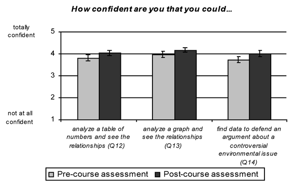
Figure 1. Student perceptions of confidence in their ability to handle quantitative information. Means ±1 SE for student responses on the pre-course and post-course assessments. Pre-course assessment N=50; post-course assessment N=49.
Faculty ratings of student work, however, were considerably lower than student perceptions of their work. Although 44 students thought they provided a good to very good response to graph 1, only 26 student responses received a score of 2 or higher (scores determined in advance to be adequate or better) by the raters (Fig 2; X2=13.76, p<0.001, df=1). For graph 2, 42 students thought they provided a good to very good response in contrast to 23 students scored at 2 or higher by the raters (Fig 2; X,2=14.24, p<0.001, df=1).
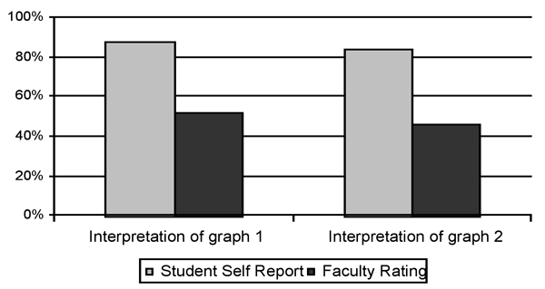
Figure 2. Comparison of student perceptions of ability and faculty ratings of the same work. Data from the pre-course assessment, N=50. Good
or better
were the top two response categories available to students for self-reporting after completing the graph assignment. For faculty, these were the numbers of scores above minimally acceptable.
Interestingly, there was no significant relationship between student perceptions of how well they thought they answered the question on the pre-course assessment and how well they were scored by the raters (r=0.08 and r=0.25, p=0.565 and p=0.084 for graphs 1 and 2, respectively, N=50 for each). There was also no significant relationship between a student's self reported ability to read a graph (Q13) and their score on either of the graph interpretation questions (r=0.05 and r=0.05 for graphs 1 and 2, respectively, N=50 for each). Students, it appears, do not have the same concept as the faculty raters of what constitutes a good response to a graphical interpretation question.
None of the demographic variables of the course assessment (academic year, major, gender, number of science classes nor number of science lab courses completed) significantly explained any of the variation in the students' actual ability to interpret a graph on the pre-course assessment instrument. However, there was a gender difference in how well the students thought they did. Men and women had nearly identical scores for the two tasks, averaging 1.90/1.85 (men/women) out of 4.0 for graph 1, and 1.68/1.78 (men/women) out of 4.0 for graph 2 (t-test p>0.6 for each). However, men were significantly more confident in their responses than were women, averaging 4.31/3.94 (men/women) out of 5.0 for graph 1, and 4.37/3.90 (men/women) out of 5.0 for graph 2 (t=2.419; p=0.019 for graph 1; t=2.406; p=0.020 for graph 2; df=48 for each). When we separated students by gender, women's perceived ability increased with their measured ability for graph 2 (r=0.41, p=0.021, N=31) but not for graph 1. Men's perceived ability was not related to their measured ability for either graph; in fact in both cases, they showed a slight, but nonsignificant negative association.
Impact of the course on graphical interpretation skills
Overall, student responses to the open-ended interpretation questions showed a slight but nonsignificant increase from the start to the end of the quarter, from a mean of 1.87 to 1.97 (interpretation of graph 1) and from 1.75 to 1.80 (interpretation of graph 2). From the pre- to the post-course assessment, the number of students receiving a rating of 2 or greater increased from 26 (52%) to 32 (64%) for graph 1 and from 23 (47%) to 29 (59%) for graph 2, though neither of these changes was significant. Overall, 22 students improved in their performance, 18 stayed roughly the same and 10 declined in performance.
The impact of the course appears to have differed for students who performed poorly initially compared to those who performed better. We coded students on the basis of their pre-course assessment scores into those who scored below the minimally competent cutoff (24 and 27 students for graphs 1 and 2, respectively) and those who scored competent or higher (26 and 23 students for graphs 1 and 2, respectively). Students who scored below minimally competent showed a significant improvement for both graphical assignments (Fig 3; t=3.062, p=0.006, df=23 and t=2.436, p=0.022, df=26 for graphs 1 and 2, respectively; paired t-test). Students who performed at or above minimally competent showed a slight but nonsignificant decline in performance (from 2.298 to 2.135 for graph 1 and from 2.337 to 2.087 for graph 2). As we defined them, none of the poorly performing students scored minimally competent in the pre-course assessment. After the course, half of them improved to at least minimally competent (12 of the 24 students for graph 1 and 13 of the 27 students for graph 2).

Figure 3. Change in average performance from the start to the end of the course for students rated in the pre-course assessment as below minimally acceptable; interpretation of graph 1, N=24; interpretation of graph 2, N=27.
None of the demographic variables of the course assessment (academic year, major, gender, number of science classes nor number of science lab courses) significantly explained any of the variation in the students' change in ability over the course.
Student perceptions of their ability to deal with quantitative data increased during the course (Fig 1), although only their self reported ability to find data (Q14) showed a significant increase (t=1.81, 2.01 and 2.05; p=0.077, 0.051, and 0.046 for questions Q12, Q13 and Q14, respectively; df=48 for each, Paired t-test; Fig 1). Averaging the three questions as a single measure, students showed a significant increase in their perceived ability to deal with quantitative data from the start to the end of the course (t=2.413, p=0.020, df=48). Gender differences in perceptions of ability were similar in the pre- and post-course assessments. That is, both men and women increased in confidence over the course and men were consistently more confident in their abilities than were women despite no difference in actual scores. There was again no significant relationship between a student's perceptions of ability and their score on either of the two graph assignments in the post-course assessment, although all relationships were weakly positive for both genders. The positive correlation for women's perception and actual performance for graph 2 in the pre-course assessment was less strong and not significant in the post-course assessment (r=0.36, p=0.051). There was also no significant relationship between a student's perceived growth in ability and either their score on the post-course assessment or the difference in scores between the pre- and post-course assessment.
Student perceptions of science
At the start of the course, most students gave responses that showed a reasonable understanding of and respect for science (Fig 4). Their most tentative responses were to the role of creativity in science and the nature of scientific observations vs scientific explanations.

Figure 4. Pre-course student attitudes and understandings about science, N=50.
Women were significantly more likely than men to agree that only science majors should have to take science classes (Fig. 5; t=2.454, p=0.018, df=48) and they were significantly more likely than men to agree that if an experiment shows that something does not work, then it is a failure (Fig 5; t=2.656, p=0.011, df=48). The difference between genders in attitude about science classes persisted in the post-course assessment although in the understanding about experiments it did not.

Figure 5. Pre-course gender differences in attitudes and understandings about science, males=19, females=31.
There was no significant impact of any other demographic variable measured on student attitudes about science courses or their understandings of the nature of science, including major, prior science courses, or prior lab science courses. There were no significant changes in attitudes and understandings about science from the pre- to the post-course assessment.
[ TOP ]
Discussion
We find it especially interesting that most students (>80%) thought they did well on the initial assessment even though we scored about half as below minimally acceptable. In addition, student confidence in dealing with quantitative information increased from the start to the end of the course. In contrast, their rated ability did not increase significantly, although students who scored poorly in the pre-course assessment scored higher in the post-course assessment. Another interesting finding is that males felt more confident than females about their responses to quantitative information although their rated scores were similar. No background data accounted for variation in initial performance or change in performance.
Student ability to interpret graphical data showed a significant increase for lower performing students over the period of this course. However, there is a statistical tendency for data that are sorted this way to show a return to the average, a phenomenon known as regression to the mean (Campbell and Kenny 1999). That is, if the data are a set of values with random error terms and you take the bottom half and subject them to new measurements, you would expect half to be above average by chance alone. The use of the rating 2
as a cut-off was made prior to the scoring of students but it resulted in roughly dividing the sample in half. Only the bottom half showed a significant improvement (+27.6 and +24.6% improvement in average scores for graphs 1 and 2, respectively; Fig 3), the upper half showed a slight decline (-7.1% and -10.7% decline in average scores for graphs 1 and 2, respectively) but this was not significant. The difference in behavior between the two sets of students suggests that regression to the mean was not the only phenomenon at work. In addition, the overall average for all students increased slightly, and there were more students above minimally acceptable in the post- than pre-course assessment (61% vs 49%). Only four students received the highest rating for a question and all four were from the post-course assessment. This all supports an interpretation of modest positive impact of the course on quantitative analysis skills and a greater impact on students who performed poorly initially.
Neither of the graphs in the study was used in the course, although other graphs which incorporated key elements of graphical interpretation were, and the instructor was deliberate in pointing these elements out. For example, several graphs in the course provided the opportunity to distinguish between correlation and causation. Indeed, in an environmental science course, this should be a prominent message, partnered with the question of how can we test the hypotheses generated from the patterns. Students may be conditioned to correctly interpret examples given in class but may not be able to generalize to new situations, especially when the relationship shown in the graph supports a pre-existing misconception about causal relationships. It is also possible that requesting a free response to the interpretation of a graph may not be the best way to determine a student's ability to interpret the information. It may be better to ask an application question that requires the interpretation of graphical information.
A positive outcome was that after encountering a lecture-based course with an intensive use of data, students reported significantly higher confidence in their dealings with quantitative information. The lack of a significant relationship between their perceptions of ability and their rated scores suggests that their greater confidence may not translate into greater ability. The difference may also reflect a greater comfort level with data instead of a greater ability to interpret quantitative information. It was interesting that men self reported greater comfort with quantitative information than did women despite their similarly rated abilities. It is also interesting that women appeared to be better than men at judging when they had given a good response.
That students' average scores in the post-course assessment were slightly below adequate and the lack of a more dramatic improvement in ability indicate that there is room for improvement in addressing this outcome. Since most students think they already have reasonably good skills, and nearly all thought they had answered the open-ended questions adequately, students may need to be confronted with the disparity between their perceptions and reality. In this study, the ratings of student responses occurred after the course was completed (to allow for the mixing of pre- and post-course assessments so we would not know which was which). Thus, students never received feedback on their responses. In addition, the classroom strategies allowed students to discuss data in small groups, but not to get specific feedback on their individual interpretations. To effect greater change, students may need to be confronted with the gap between their perceptions of ability and what is recognized as a good response. They may also need more opportunities to practice the interpretation of graphical data. For this study, there was no effect of year in college or major on ability or change in ability to interpret graphical data. This suggests that students may not get many opportunities to practice these skills in other college courses.
There were no changes in student understandings about the nature of science (as addressed by the questionnaire) as a result of this course. None of these understandings were a focus of the course or discussed specifically in class, but it was hoped that by providing cases in which scientific understandings were developed through observation and experimentation, a better understanding of the nature of science would emerge. Studies on student learning suggest that active reflection of the learning process by students may be needed to change their views of the nature of science (Schwartz et al. 2004). In this course, presentations and discussions of advances in scientific knowledge through case studies were not enough to produce measurable changes in student understandings of the nature of science to the degree applied in this study and as assessed by the course assessment.
Had we not conducted this study, we would not have been able to determine if the course that we proposed to meet a quantitative liberal studies requirement was in fact supporting the development of these skills. In addition, we would not have known what teaching approaches were working and where there was opportunity for experimentation and room for improvement. We do not know whether this course works as well as a lab-based course in developing students' quantitative skills, but it is clear that we have the tools to answer that question. As we determine what we want our students to know and how best to develop these skills and understandings, it is both empowering and humbling to ask how well we are doing.
[ TOP ]
Practitioner Reflections (JB)
Like many of my colleagues, I enjoy searching through TIEE for ways to be a better teacher, and I have tried many of the ideas from TIEE in both lab and lecture. I know that my institution supports the scholarship of teaching and requires direct measures of student learning as part of academic review, but it was not until the call for participants for the TIEE practitioner research project that I thought about doing research on my own teaching. I enjoyed the sense of shared mission in the initial workshop at the 2005 ESA Annual Meeting. Then held accountable to see this through, I picked the assessment of graphical interpretation because it was doable
and consistent with the learning outcomes for the course.
I found the literature on the assessment of student learning to be eye-opening, if somewhat discouraging. After reading Handelsman et al. (2004), I accepted their premise that we should rely on evidence to support our claims of efficacy in the classroom, but remained skeptical of their admonition that we should apply the same standards of rigor to the assessment of teaching as we do to our field research. Issues of pseudo-replication and especially of lack of suitable controls (Kember, 2003) made it seem to me that we had no choice but to hold these two types of inquiries to different standards of rigor. But, I do agree that as we try out different instructional strategies, we should create ways to assess their impacts on our students' learning. Kember (2003) says that we may generate the best evidence in support of instructional innovation through a synthesis of separate investigations using different methods of evaluation. This seemed to be just what we were doing in the TIEE project. The standards of rigor, then, are not necessarily tied to any specific investigation, but to the interpretation of our cumulative efforts at assessment. The sharing of evidence is key.
After lots of communication among the TIEE group, my colleague Maggie Workman, and I designed our assessment project. The first thing I realized after we designed this project was that I needed to be less casual about the design of my instruction if we were to assess its learning outcomes. I've used case studies about frog deformities and deer overpopulation in past courses, but this time I was more deliberate in how I developed the cases so that the entire story was developed logically and compellingly through data. By being clear on what learning outcomes I wanted to assess, I made sure to include instructional opportunities to address them. The next difficulty was in designing an instrument that assessed student abilities independent of the content of the course. I believe that a strength of having scientists involved in the evaluation of student learning outcomes is that they have the knowledge of experimental design to test, as fairly as possible, the hypotheses they propose. There is a little envy here, too. Now that I focus my efforts mainly on teaching, I can collect data on students just as I used to through field work.
While our primary goal for this project was the assessment of our students' ability to interpret graphs, one of the reasons I have used cases in the past has been so that students have a better understanding of how we have come to know what we know in science. While I routinely use data slides to support course concepts, when we do not tell the story behind the data, we risk students not being able to tell the difference between science based on real data and something that resembles science…but is based on uncontrolled experiments, anecdotal evidence, and passionate assertions
(Rensberger, 2000, p. 61).
As a result of this study, I plan to build in more opportunities to give students feedback on their interpretation of quantitative data. I clearly can not count on their self reported claims of confidence. My curiosity has also been piqued by the lack of change on student perceptions of how science works. I appreciate the role that ESA has taken in encouraging both the assessment and sharing of studies evaluating the instructional material available through TIEE. My participation has made me more thoughtful about the type of evidence needed to support my beliefs that my instruction is making an impact on my students' learning.
[ TOP ]
References
- American Association for the Advancement of Science (AAAS). 1990. Science for all Americans: Project 2061. Oxford University Press, New York, USA.
- Blaustein, A. R., J. M. Kiesecker, D. P. Chivers, and R.G. Anthony. 1997. Ambient UV-B radiation causes deformities in amphibian embryos. Proceedings of the National Academy of Sciences 94: 13735-13737.
- Burkhart J. G., J. C. Helgen, D. J. Fort, K. Gallagher, D. Bowers, T. L. Propst, M. Gernes, J. Magner, M. D. Shelby, and G. Lucier. 1998. Induction of mortality and malformation in Xenopus laevis embryos by water sources associated with field frog deformities. Environmental Health Perspectives 106:841-848.
- Campbell, D. T. and D. A. Kenny. 1999. A Primer on Regression Artifacts. Guilford Press, New York, USA.
- D'Avanzo, C. 2000. Evaluation of course reforms: a primer on what it is and why you should do it. Bulletin of the Ecological Society of America 81:206-209.
- D'Avanzo, C. July 2004, posting date. Evolution of Ideas about Causes of Amphibian Deformities. Teaching Issues and Experiments in Ecology, Vol 2: Issues: Frontiers Issue #2 [online]. Viewed 28 Feb 2007. (http://tiee.ecoed.net/vol/v2/issues/frontier_sets/amphibians/abstract.html)
- Ebert-May, D. and C. Brewer. 1997. Innovation in large lectures – teaching for active learning. Bioscience 47: 601-607.
- Ebert-May, D., J. Hodder, K. Williams and D. Luckie. 2004. Pathways to scientific teaching. Frontiers in Ecology and the Environment 2: 323.
- Handelsman J, D. Ebert-May, R. Beichner, P. Bruns, A. Chang, R. DeHaan, J. Gentile, S. Lauffer, J. Stewart, S. M. Tilghman and W. B. Wood. 2004. Scientific Teaching. Science 304:521-22.
- Johnson, P. T. J., K. B. Lunde, E. G. Ritchie and A. E. Launer. 1999. The effect of trematode infection on amphibian limb development and survivorship. Science 284: 802-804.
- Johnson, P. T. J., K. B. Lunde, E. M. Thurman, E. G. Ritchie, S. N. Wray, D. R. Sutherland, J. M. Kapfer, T. J. Frest, J. Bowerman and A. R. Blaustein. 2002. Parasite (Ribeiroia ondatrae) infection linked to amphibian malformations in the western United States. Ecological Monographs 72:151-168.
- Kember, D. 2003. To control or not to control: the question of whether experimental designs are appropriate for evaluating teaching innovations in higher education. Assessment & Evaluation in Higher Education 28:89-101.
- Kiesecker, J. M. 2002. Synergism between trematode infection and pesticide exposure: A link to amphibian limb deformities in nature? Proceedings of the National Academy of Sciences 99: 9900–9904.
- National Research Council (NRC). 1996. National science education standards. National Academy Press, Washington DC, USA.
- Picone, C., J. Rhode, L. Hyatt, and T. Parshall. 2007. Assessing gains in undergraduate students' abilities to analyze graphical data. Teaching Issues and Experiments in Ecology, Vol. 5: Research #1 [online]. June 2007, posting date. (http://tiee.ecoed.net/vol/v5/research/picone/abstract.html)
- Rensberger, B. 2000. The Nature of Evidence. Science 289: 61.
- Rosenberry, D. O. 2001. Malformed frogs in Minnesota: an update. U.S. Geological Survey Fact Sheet 043-01. Viewed 28 Feb 2007. (http://pubs.usgs.gov/fs/fs-043-01/pdf/fs-043-01.pdf)
- Schwartz, R. S., N. G. Lederman and B. A. Crawford. 2004. Developing views of nature of science in an authentic context: an explicit approach to bridging the gap between nature of science and scientific inquiry. Science Teacher Education 88:610-646.
- SPSS. 2005. SPSS 14.0 for Windows. SPSS, Chicago, Illinois, USA.
[ TOP ]