VOLUME 3: Table of Contents
TEACHING ISSUES AND EXPERIMENTS IN ECOLOGY
TEACHING
ALL VOLUMES
SUBMIT WORK
SEARCH

STUDENT INSTRUCTIONS
The Kuparuk River Experiment
The Data Set you will be working with is from a 15-year study (1983-1998) in a small artic river. The site is the Arctic Long-Term Ecological Research (ARC LTER) site (http://ecosystems.mbl.edu/arc/overview.html) in the beautiful foothills of the North Slope of Alaska (north of the Arctic Circle, latitude about 68°N). This area has continuous permafrost, and snow covers the ground for 7-9 months. There is 24 hours of sunlight during short cool summers and periods of complete darkness during long cold winters. There are no trees and many pristine lakes and streams. Vegetation is tundra with tussock tundra in the lower, wetter places (mainly grasses and sedges plus some dwarf birch and willows) and heath tundra on the drier ridge tops.
The focus of the research is the Kuparuk River, a fairly small (about 20 meters across in the study area), clear, and meandering river easily accessible by the only highway in the region. Many scientists who work at the ARC LTER are interested in questions related to nutrient limitation. Ecologists study limiting nutrients such as nitrogen (N) or phosphorus (P) by adding these nutrients to a system and watching what happens. When people grow vegetables, they add these same limiting nutrients when they use fertilizers.
Ecologists are interested in nutrient effects on ecosystems because human activity (agriculture, sewage, car emissions) is resulting in massive additions of nutrients to aquatic and terrestrial ecosystems worldwide. The scientists working on the Kuparuk River look at these effects in a pristine location in northern Alaska to assess human influences in a place with little obvious contamination so far.
This research entailed dripping P into the river during summer months in order to increase P concentrations to a set concentration above the very low background levels. The effects of the P addition were then traced up the stream food web. As is evident in this Data Set, the effect is profound; it is especially interesting that these changes could not have been predicted ahead of time.
The vegetation in this river includes algae and moss growing on rocks on the river bottom. To assess algal abundance, the scientists measured the amount of the green pigment chlorophyll on randomly collected rocks. These algae are called epilithic because they grow on top of rocks (epi="on", lithic="rocks"). Moss abundance was estimated as percent cover in randomly selected 0.25 square meter areas. One hundred percent cover means the square area is completely covered with moss, 50% means half covered, and so on.
Most animals living on the river bottom in the Kuparuk are insect larvae (the aquatic stages of flying insects such as mosquitoes and black flies which are abundant in Alaska). The ecologists focused on Baetis species (mayflies) because they are the main grazing animals that eat the epilithic algae.
Higher up the food web in this river are Arctic grayling, the only fish in the specific study site. These are beautiful fish that look something like trout. On average they are about 30-40 cm long (6 = about 15 cm) and dark with iridescent spots on the sail-like dorsal fin. They eat drifting aquatic insects such as mayflies and caddis flies. Their maximum age is 11-12 years. Arctic grayling are caught by Inuit, Native Americans, and many sports fishermen.
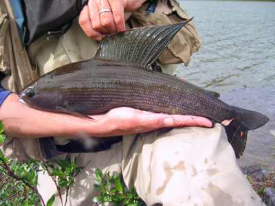
Arctic Grayling
Copyright: Jonathan Benstead, The Ecosystems Center at MBL
The Data Set
You will be working with data in the Excel file provided to you. These are the actual data collected by the ARC LTER scientists. First look at all the headings at the tops of the columns to make sure you understand the data overall.
Epilithic Chlorophyll A: To make a graph of the chlorophyll concentrations (a measure of algal biomass) from 1983-1998, first select the Graph Wizard Icon on your toolbar. This will open a new window for creating your graph. To make a simple bar graph of chlorophyll over time choose the Column chart type and then Clustered Column from among the chart sub-types; then click the Next button. Excel will ask you for the Data Range. Highlight only the numbers in the column labeled Reference chl a. These are the chlorophyll values in the non-fertilized part of the river just upstream of the drip location. Next click on the tab titled Series at the top of the new window. Excel will now ask you for the values for the x-axis. Click on the box next to Category (x) axis labels and then highlight the numbers 83-98 in the column titled Year. In the box next to Name in this same window, type Reference. Then click Next.
You can now see the graph you just made of chlorophyll concentration over time in the reference location. Fill in the boxes titled chart title and so on. Keep these labels very simple,.e.g., Chlorophyll a, Year," etc.
Now add the Standard Error bars to the data on your graph. These are a statistical measure of the variation between samples. On your graph, simply right-click on one of the bars. On the menu that appears you will see a range of options. Select Format Data Series. Then select Y Error Bars" from the tabs at the top of the new window. The Display choices at the top of the window indicate whether you want both plus and minus error bars, plus only, etc. For now, select both — you can change it later if you wish. Since each standard error (S.E.) is different for each chlorophyll value, select Custom. First click the "+" box and then highlight the column labeled "S.E." next to the chlorophyll a reference values. Click on the - box and then highlight the same column. Select OK and the standard error numbers will be added to the graph.
The next step is to add the chlorophyll values for the fertilized section of the river. To do this, first left-click anywhere in the chart area. This will make the Chart option appear on the Excel toolbar. Click Chart on the toolbar, and from the drop-down menu select Add Data… Excel will ask for the range of the data you want to add; highlight the numbers in the Fertilized Chl a column. Now you can compare the pigment concentrations in the fertilized and non-fertilized parts of the river. Add the S.E. values for the Fertilized numbers as described above. To add a name to this data series, first right-click on any one of the bars. Select Source Data from the menu that appears. In the box titled Series, select Series 2. Then type Fertilized in the box next to Name. You should now have a legend which indicates which bars correspond with each group of data.
Your teacher will help you with the finer details of making clear and simple graphs, but here is a suggestion about the look of the bars (i.e., colored, patterned, etc.). You will probably want to use colors; that is OK but scientists publishing their data in a research paper do not usually do that since they have to use black and white. To make a visually clear graph, right-click on one of Fertilized bars, select the Format Data Series option, and then select Patterns from the tabs at the top of the new window. Instead of a color, select the little black square; now the fertilized values will be black. Do the same thing for the reference numbers but select white instead of black. You now have an easy to read, straightforward graph.
Baetis and Arctic grayling: Follow the same steps as described above to make graphs of the Baetis (mayflies) densities and Arctic grayling weight.
River Temperature and Flow Rate: Again, use the same procedure to make these graphs.
Interpretation and Discussion: After you make your graphs, your teacher will explain the next steps.
<top>