Introduction
The content of courses and the methods by which students learn are crucial in teaching the life sciences (NRC 1999, NRC 2003). Skills in data analysis and graph interpretation are particularly critical, not only in training future scientists (Mathewson 1999) but for all students. As members of the general public, all students must make informed decisions about scientific issues and controversies (von Roten 2006). However, graph presentation and interpretation are difficult skills that require cognitive steps that may be new to college students (Preece and Janvier 1992; Bowen et al 1999; Roth et al 1999: Bowen and Roth 2002; Roth 2004; Roth and McGinn 1997). Faculty teaching ecology and environmental courses should assess whether our courses are improving critical skills such as graph interpretation and should evaluate the most effective practices (D'Avanzo 2000; 2003a; Handelsman et al. 2004). In this study, we assessed changes in graph interpretation skills demonstrated by undergraduate students in our courses at four colleges.
Our study had two goals. The first was to use a variety of quantitative materials to train students to interpret ecological data. We developed analytical and graphing exercises to improve analytical skills, and we integrated these exercises into lectures and labs. The exercises were adapted from the ESA's electronic publication, Teaching Issues and Experiments in Ecology (TIEE). TIEE provides teachers with case studies, graphs, data sets, and essays that encourage active learning and impart a greater understanding of the science behind ecology. We developed exercises that would engage and challenge students with the material through student-active learning and other strategies demonstrated to be effective for teaching difficult content and scientific skills (Ebert-May and Brewer 1997; McNeal and D'Avanzo 1997; D'Avanzo 2003a,b; Brewer 2004; Handelsman et al. 2004). Our exercises required students to interpret scatterplots, line graphs and bar graphs, and to produce their own graphs from data. Several of these exercises are appended as tools for faculty to adopt in their own courses (see Resources).
Our second goal was to develop assessment tools to measure students' abilities to create and interpret graphical information. At the beginning, during, and end of our courses we tested students' analytical skills in order to assess the impacts of our teaching and to reveal which skills were most challenging to our students. Our study was not designed to assess the effectiveness of any particular teaching method we used (lectures, labs, or analytical exercises), but rather the effectiveness of each course as a whole. As such, our study provides tools and recommendations for outcomes assessment, which is increasingly required by state and regional accrediting agencies. Despite extensive experience doing research, most ecologists have little background in educational research and assessment of their teaching (D'Avanzo 2003a,b). Such assessment, however, is an important first step to improve the quality of our teaching and to develop more scientific approaches to teaching (D'Avanzo 2000; 2003a; Handelsman et al. 2004). An example assessment tool is appended (see Pre-Post Test in Resources).
Most previous work on graph interpretation has focused on middle and secondary students (reviewed in Phillips 1997). Our assessment research contributes to the field of pedagogical research by adding to the few studies that have addressed analytical skills at the tertiary level of education (Bowen et al 1999; Bowen and Roth 2002). By assessing large populations of undergraduates from two different student populations (science majors and non-majors) at four different institutions, we can draw general conclusions about analytical skills and methods of teaching these skills at this level.
Methods
We assessed skills and progress of 240 students at four institutions: Fitchburg State College (MA), Georgia College & State University (GA), Rider University (NJ) and Westfield State College (MA). Most students tested (66%) were non-science majors in introductory Environmental Science or Life Science courses, and the remainder (33%) were science majors in introductory Ecology courses (Table 1).
| Institution | Instructor | Course (year) | Students Tested | Class Size | Analytical Exercise Topics | Lab? | Assessment Tool |
|---|---|---|---|---|---|---|---|
| Fitchburg State College | Picone | Environmental Science (2005, 2006) | 8 majors, 22 non-majors | 14-16 |
|
yes |
Pre- and post-test with identical questions;
In 2006, also used exam questions every few weeks |
| Ecology (2005, 2006) | 56 majors | 26-31 |
|
yes |
Pre- and post-test with identical questions;
In 2006, also used exam questions every few weeks |
||
| Georgia College & State University | Rhode | Environmental Science (2005) | 45 non-majors | 45 |
|
yes | Pre- and post-test with different questions |
| Ecology (2005) | 24 majors | 24 |
|
yes |
Pre- and post-test with identical questions;
In 2006, also used exam questions every few weeks |
||
| Rider University | Hyatt | Life Science (2005) | 50 non-majors | 50 |
|
no | Questions at beginning and every few weeks on exams |
| Westfield State College | Parshall | Environmental Science (2005) | 48 non-majors | 48 |
|
yes | Pre- and post-test with identical questions |
Each investigator used several strategies to teach analytical and graphing skills. First, we began with a single lecture or lab that provided background on interpreting and creating graphs. While we each developed this background material independently, it was based on the Step-One, Step-Two
strategy (TIEE 2005). In step-one,
students describe how the graph is set up: the variables, axes, legend, and patterns in the data. In step-two,
students interpret the graph and the relationships among variables. An example handout from this presentation is appended (see How To Read A Graph in Resources).
Second, we created exercises in which students interpreted data and graphs as a means to learn course content. We included graphs and data sets available from the TIEE site, supplemented with graphs from primary literature. Because our courses covered different content, we did not use identical exercises, although some exercises were shared among two or three investigators (Table 1). Example exercises from four topics are appended (see Examples in Resources). Exercises were presented every few weeks when appropriate, given the schedule of lecture and lab topics. Most exercises only occupied 20-30 minutes within a single lecture or lab, while a few required a 2-3 hour lab period, and a few were assigned as homework. Exercises were designed as small group, collaborative activities in which students presented their work orally in class or as a written assignment. Students received oral and written feedback during class discussions and assignments. In addition to these exercises, every week's lectures included graphs to reinforce principles covered in both the background material and analytical exercises.
Five of the six courses in this study also included a lab (Table 1). In most labs, students created graphs from raw data, including data the students collected. Skills included generating scatterplots and bar graphs of means with error bars, and most importantly, interpreting the trends to test hypotheses. To improve understanding, we required students to first plan their graphs by sketching them out by hand before plotting the data with Microsoft Excel.
To assess whether our courses improved student’s skills, we compared responses to test questions before, during, and after each course. Three investigators emphasized pre- and post-tests (see Pre-Post Test in Resources for an example). Two of these researchers used pre- and post-tests with identical questions, and one changed the questions in the post-test (Table 1). The fourth researcher monitored skills throughout the course with a pre-course survey and analytical questions incorporated into course exams every few weeks. Because we used different assessment strategies and may have worked with different types of students, we analyzed the results from each researcher separately.
Despite differences in testing design, we generally assessed similar skills in our students:
- Interpreting simple bar graphs and scatterplots
- Interpreting scatterplots with multiple independent and dependent variables
- Distinguishing independent and dependent variables
- Interpreting bar graphs with interactions
- Choosing the correct type of graph (bar vs. scatterplot) to summarize data
- Using a mean to summarize categorical data
- Designating and precisely labeling axes
We developed rubrics to determine whether answers in post-tests could be categorized as Improved,
No change, satisfactory,
No change, unsatisfactory
or Worsened
compared to the pre-test. The rubric depended on the skill assessed and the test question. Specific rubrics are provided with their corresponding test questions in the Results.
Results
Areas where students’ analytical skills improved
At all four institutions our courses and exercises improved students' abilities to interpret graphs (Figure 1). Students were presented graphs and asked to explain the patterns among variables. Test questions were either open-ended (short-answer) or multiple-choice (e.g., see Example #1 in Pre-Post Test in Resources). The percent of correct answers varied with the complexity of the graph and with the school or instructor (Figure 1). Prior to our courses, only 25-60 percent of students could correctly describe the patterns among variables in a graph (Figure 1). For instance, students' descriptions often omitted trends in a complex graph, or they used imprecise language to describe trends (e.g., this graph describes effects of…
, the variables are related
or the variables are linear
). Sometimes students confused cause and effect, or indicated poor understanding of the figure. After our courses, over 75-90 percent of students at each institution were proficient in interpreting graphs (Figure 1). Students were more thorough in their descriptions, and they used more precise language e.g., nitrogen and phosphorous are positively correlated.
Their descriptions indicated they had increased their understanding of the ecology depicted in the graphs.
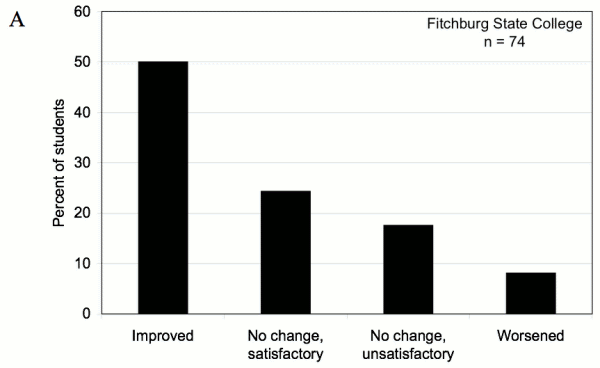
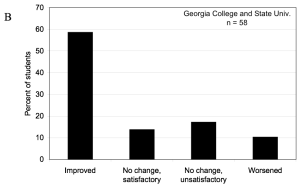
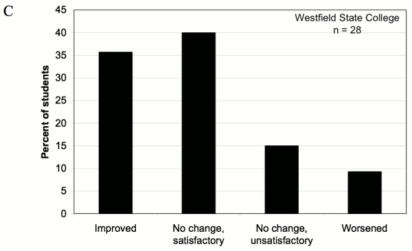
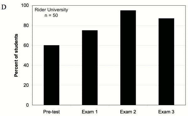
Figure 1. Ability to Interpret Graphs — Students' ability to interpret and summarize graphs. (A-C) Percent of students whose answers improved, did not change, or worsened in the post-test compared to the pre-test. Students were asked to describe the relationships among variables in both scatterplots and bar graphs. (D) Percent of students at Rider University with at least partially correct responses to exam questions that required graph interpretation. Exams at Rider were given every three-four weeks, and students were asked to describe relationships among variables in bar graphs.
Our courses also improved students' ability to create graphs, and therefore interpret data. In one example, students were presented with data that should be summarized as a scatterplot (Example #4 in Pre-Post Test). By the end of each course, more than 75 percent of students could create a proper scatterplot, with the axes correctly placed and labeled, and with accurate descriptions of trends (Figure 2). The number of proficient students increased 35-45 percent compared to the pre-test. To assess skills in making bar graphs, students at Fitchburg State were also asked to plot categorical data (Example #3 in Pre-Post Test). Almost 50 percent of students improved in this basic skill (Figure 3).
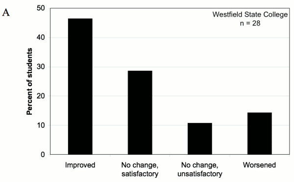

Figure 2. Create Scatterplots — Comparison of students' skills to create a simple scatterplot from raw data in pre- and post-tests at (A) Westfield State College and (B) Fitchburg State College. Responses were only considered improved or satisfactory if students located the independent and dependent axes correctly, labeled the axes accurately, and used a scatterplot format to summarize continuous data.
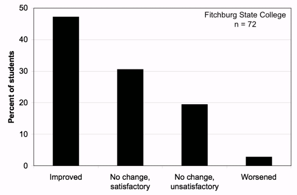
Figure 3. Choose a Bar Graph Format — Change in students' ability to create a bar graph from categorical data in pre- and post-tests. Data are from Fitchburg State College (N=74). Responses were considered improved or satisfactory if students used a bar graph format.
Areas where students' analytical skills did not improve
Identifying independent and dependent variables
Our results also indicated several areas where most undergraduates continued to struggle despite our lectures, labs and exercises. First, we tested for both superficial and deeper understandings of independent and dependent variables. This concept may be important for students to understand experimental design and to interpret data. Our students could easily identify independent and dependent variables in simple graphs, but not in graphs with more than two variables. For example, when exam questions asked students to identify the independent/dependent variables in simple graphs, 80-90 percent of students answered correctly at Rider University (Figure 4) and at Fitchburg State (N=43; data not presented because it was from a single test.) However, when complex graphs included multiple independent or dependent variables, far fewer students were successful. For instance, Example #1 in the Pre-Post test presents a scatterplot with two dependent variables (nitrogen and phosphorus concentrations) and one independent variable (biomes tested). When the post-test asked students to list all dependent and independent variables in this figure, only 30-40 percent correctly listed and categorized all three variables. Earlier in the semester at Fitchburg State, only a few more students (50-57 percent) had accomplished this task with similarly complex graphs on exams, when the definitions of these variables had been recently learned and were easier to recall. Therefore, this concept seems to have been understood by only half the students and retained by even fewer.
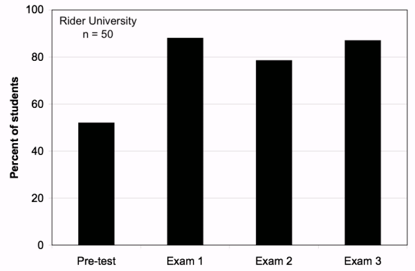
Figure 4. Independent and Dependent Variables — At Rider University, students were asked several times through the semester to identify independent and dependent variables in simple graphs. 80-90% of students understood the basic concept.
Likewise, half of the students struggled with the following multiple-choice question from the pre- and post-test (see Pre-Post Test in Resources):
- In a graph, the dependent variable…
- A. is plotted on the x axis
- B. is measured in the same units as the independent variable
- C. is hypothesized to respond to changes in the independent variable
- D. describes the experimental treatments
- (correct answer: C)
In the post-test, only 51 % answered correctly (Figure 5). This represents only a slight improvement from the 43 % who answered correctly in the pre-test.

Figure 5. Independent and Dependent Variables — Comparing pre- and post test responses to a multiple-choice question about dependent variables (see text). Only 51 % answered correctly in the post-test.
Detecting trends in data
A second area in which undergraduates struggled was the ability to discern general trends amid statistical noise
in data. Many students believed that any variation in the data resulted from important factors worth emphasizing. In one example, students were presented the number of days of lake ice on Lake Mendota, WI over the last 150 years (see Climate Change in Resources). An especially warm or cold year (outlier) often distracted them from seeing more important, long-term trends. Similarly, most students graphed every data point in a bar graph, rather than summarize the trends with a mean value. In the post-test, students were given categorical data on the number of eggs laid by Daphnia fed from two sources, and they were asked to summarize the pattern with an appropriate graph (Example #3 in Pre-Post Test). The replicate number
was listed in the first column of data as a distracter. Most students (57 %) plotted the replicate number as the independent variable on the x-axis (Figure 6A), and most (67 %) did not use a mean to summarize the trends (Figure 6B). Similar results were obtained from questions incorporated into course exams (data not presented). These data from bar graphs and scatterplots suggest that our students generally emphasized individual data points rather than overall trends.
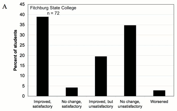
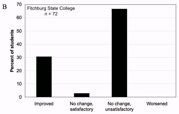
Figure 6. Results from a pre- and post-test question in which students were asked to make a graph from raw data (Example #3 in Pre-Post Test). (A) Ability to choose and format axes of a graph. Answers were only improved or satisfactory if the students placed the correct dependent variable on the y-axis and correct independent variable on the x-axis. Answers were Improved but unsatisfactory
in the post-test if the axis labels were improved and/or if the correct dependent variable was plotted, but the student continued to use Replicate
for the x-axis. (B) Ability to plot the mean, rather than all the raw data individually. Only 33 percent used the average in the post-test, despite several exercises and labs that covered this skill.
Interpreting interactions among variables
Finally, students seemed to have difficulty interpreting interactions among variables. To test this skill, we presented a bar graph from an experiment with a 3x3 factorial design (Example #2 in Pre-Post Test). Frog survival was measured in relation to exposure to three predator treatments crossed with three pesticide treatments. Answers were only considered correct (Improved
or Satisfactory
) if students recognized that — according to the graph — malathion increased frog survival in the presence of beetles, and therefore should not be banned to protect frogs. This required students to recognize the significant interaction between pesticides and predators. Answers were unsatisfactory if they were unclear, confused, or incomplete, including statements such as pesticides decreased frog populations
or there is little effect of pesticides,
or if students recognized that malathion killed beetles
while also recommending that it should be banned. In the post-test only 23 of 74 students recognized a likely benefit of malathion, and there was no net improvement in the post-test answers (Figure 7).

Figure 7. Interpret Interaction — Ability to interpret a bar graph with interactions (Example #2 in Pre-Post Test). Data are from Fitchburg State College (N=74). Answers were categorized as Improved
or Satisfactory
only if students recognized that malathion would increase amphibian survival.
Discussion
Teaching analytical skills
Our assessment tools revealed some analytical skills that can be taught to undergraduates with relative ease and other areas where students continued to struggle despite our efforts to include extensive data analysis and interpretation in our courses. In post-tests, 75-90 % of students were capable of creating and interpreting simple bar graphs, scatterplots and line graphs (Figures 1-3). Success with simple graphs has also been found in studies of middle and secondary school students (e.g., Phillips 1997; Tairab & Khalaf Al-Naqbi 2004).
Our study was designed to determine whether our courses as a whole improved analytical skills, so we cannot compare the relative effectiveness of any particular strategy we used. However, at the end of their courses, students at Fitchburg State were asked to comment if there were any activities, exercises, labs or concepts that helped them with the post-test. All of the strategies we used were praised in their responses. The most commonly cited strategy was the background introduction to graphing (e.g., when to use a line graph vs. a bar graph, and which axes are which
). Some students cited the graphs we discussed from group exercises and lectures. Others noted the benefits from plotting data from their labs as a way to better design and interpret graphs. Several recalled that using Microsoft Excel helped them, even though Excel is very frustrating.
A few students noted how everything combined helped
or that it takes repetition when it comes to understanding graphs.
Although our courses improved some analytical skills, students continued to struggle in several specific areas. First, most students lacked a profound understanding of dependent and independent variables: most could define these variables from simple graphs but not from complex graphs with more than two variables.
We thought that the ability to define and identify independent and dependent variables would be essential to understanding experimental design and the graphs. However, our results suggest that misapplying these terms does not necessarily inhibit general analytical skills. While only 30-40 percent of students were able to identify these variables from a complex graph in the post-test, most (75 %) could clearly describe the relationships among those same variables (Figure 1A). Because our goal was to help students improve broad analytical understanding, and to apply rather than memorize definitions, perhaps their understanding of these variable types was sufficient.
A second area in which students struggled was the ability to distinguish trends with statistically variable or noisy
data (Clement 1989). In scatterplots, many students emphasized individual variation, failing to discern general trends or perceiving trends where none existed. When plotting categorical data, most students graphed individual data points rather than summarizing trends with means (Figure 6). During the semester we included several lab exercises in which students plotted means from data they had collected, yet most did not seem to internalize these lessons.
Alternatively, the results in Figure 6 may be due to a poorly-designed test question rather than poor student skills. Example #3 in the post-test required a bar graph from treatments with only four replicates. In contrast, the bar graphs from lab exercises included treatments with dozens of replicates. If the test question was more like the data that students had collected and summarized, many more students might have chosen to graph a mean.
In any case, the ability to find patterns amid variable data is a difficult skill that deserves special attention in our courses, particularly because variation is the norm in ecological data. In introductory courses and textbooks, students get little exposure to noisy, highly variable data in graphs (e.g., Roth et al 1999). Ecological data, by contrast, are typically noisy because phenomena are influenced by multiple (and often unpredictable) independent factors such as climate, community interactions, and disturbance history. Moreover, different mechanisms will determine the outcome from these factors depending on the scale of space and time. Undergraduate students need more practice plotting, interpreting, and making predictions from such complexity (Brewer and Gross 2003). Ecology and environmental science courses, perhaps more than other areas of biology or the physical sciences, provide valuable opportunities to practice working with these kinds of data sets.
When learning to plot data, computer-based graphing programs must be used carefully to avoid interfering with learning. Software used for graphing, such as Microsoft Excel, can reinforce students' misperceptions about plotting data, or worse, allow them to produce meaningless graphs. We recommend that students first sketch by hand a basic format of their graph before plotting any data on a computer (Roth and Bowen 2006). Quick sketches are sufficient to determine: 1) what type of graph is appropriate (scatterplot, bar graph, etc.), 2) how the data should be organized (as means, with legends, etc.), and 3) how the axes should be placed and labeled. This simple method forces students to think actively about what message they want to convey from the data, rather than passively allowing the computer to produce a graph for them or following a lab manual's step-by-step instructions. Anecdotally, we found that students understood graphing principles better when they started with a quick, hand-drawn sketch. Moreover, sketching a graph from their hypotheses or predictions is useful even before they collect data, and may improve experimental design in inquiry-based labs.
A third analytical skill in which we saw little improvement was the ability to interpret interactions among variables. Students were presented a bar graph of frog survival with interactions between pesticide and predator treatments (Example #2 in Pre-Post Test). The interaction was interpreted correctly if the student recognized that one pesticide (malathion) should not be banned to protect frogs. In the post-test, only 31 % of students answered correctly (Figure 7); however, incorrect answers to this question might have been influenced by content knowledge, rather than a lack of analytical skills. Perhaps answers were confounded by knowledge of the typical negative effects that pesticides have on amphibian survival (e.g., Reylea 2005), which was discussed earlier in the course. Alternatively, perhaps students did not understand that beetle predators are typical in environments with amphibians. This example may illustrate how graph interpretation, even of simple figures, is greatly influenced by the experience and context that are familiar to the viewer (Preece and Janvier 1992; Phillips 1997; Bowen et al 1999; Roth 2004). Moreover, interactions can be difficult to interpret for scientists at any level, so the fact that undergraduates showed little improvement is neither surprising nor discouraging.
Practitioner Reflections
Assessment of student skills and content knowledge is an increasingly common requirement of college accreditation, and an important component of scientific teaching
to discern effective practices (D'Avanzo 2000; 2003a; Handelsman et al 2004). Like most ecologists (D'Avanzo 2003a,b), we were new to course assessment and educational research when we began this study. We learned from some mistakes in our strategies and assessment tools, and from them we developed the following advice for others beginning to study their own teaching of analytical skills.
Focus on a small number of skills
Our test instruments (e.g., Pre-Post Test) covered a wide range of analytical skills (See Methods). This shotgun
approach was useful at the beginning of our study to reveal students' strengths and weaknesses that we would not have predicted a priori. However, this approach quickly generated a large quantity of different assessment materials, and it was difficult to transform that material into useful data regarding student learning. Moreover, long assessment tests can be tiring and annoying for students, especially when they do not count towards a grade. Therefore, shorter assessments that focus on only a few (≤ 3) questions or skills may be more practical for pedagogical researchers, classroom instructors, and students alike. In addition, shorter tests are easily incorporated into mid-course assessments.
Our long list of assessed skills emphasized ecological data with realistic variation plotted as scatterplots or bar graphs with error bars. However, ecology courses also feature line graphs to demonstrate models about fundamental concepts such as population size, growth rates, and diversity relationships. Because line graphs are among the most difficult for students to grasp (Weintraub 1967; Berg and Phillips 1994), they provide another important source of data for assessing development of analytical skills.
In addition to selecting a short list of skills to assess, researchers should carefully choose questions that have something quantifiable in the answers or some objective means to determine whether students improved. Focusing on objective answers will save the researcher time. However, easily assessed answers might come at a cost in accuracy. As questions become easier to score and less open-ended (such as multiple-choice), answers might not reflect student progress and understanding (Berg and Smith 1994). Students may get the correct answer for the wrong reasons or get an incorrect answer through a sophisticated interpretation. The reasons for student mistakes are more easily discerned with free-response questions. If open-ended questions are used then clear rubrics are needed, and they should be coordinated among all researchers collaborating on a study.
Carefully plan timing and content of the test questions
Pre- and post-tests are useful for several reasons. The same questions can be used in both tests, making it easier to compare answers to assess whether students have improved. Because we placed our post-test at the end of the semester, students were able to draw upon all of the exercises and experiences from the semester, and the course as a whole was assessed rather than a single exercise. Moreover, the post-test came many weeks after some skills were introduced, and therefore it assessed whether the analytical skills were really understood and retained, rather than simply repeated from short-term memory.
However, post-tests also present some disadvantages. Students could improve in a post-test simply from increased content knowledge about the topics or context of the data rather than increased analytical skills (Preece and Janvier 1992; Phillips 1997; Bowen et al 1999). Alternatively, saving all of the assessment for one large post-test might reduce student scores because they are simply tired from a long test. Student schedules are especially hectic at the end of the semester, which can further reduce the number and/or quality of responses for post-tests, especially when they are not part of the course grade. Therefore, long, end-of-semester post-tests probably underestimate skills and progress.
To overcome these drawbacks, data should be collected at intervals throughout a course. Such data can be used to corroborate trends from the pre- and post-tests or replace a separate post-test entirely. Assessment questions can be incorporated easily into exercises during lecture and/or graded exams, as was done at Rider University in this study. Most importantly, such data provides formative assessment during a course, and corrections can be made before the semester ends (D'Avanzo 2000; Brewer 2004). One mistake we made in our study was to examine the data only after each course was completed, when it was too late to improve our pedagogy for that group of students.
Besides timing, assessment questions must be carefully developed. For example, should pre- and post-test questions use identical data and graphs, or should the graphs have similar format but different topics? Using identical questions makes it easier to compare answers between tests, but it runs the risk of students remembering questions they had seen in the pre-test (or worse, repeating errors because they had practiced making them earlier on that same question). If pre-tests have different questions from post-tests, then the level of difficulty should remain constant. It is tempting to increase the difficulty in subsequent tests — as we often do when testing content knowledge in a course — but increasing the difficulty of assessment questions confounds interpretation of the data.
Finally, the researcher must decide whether (or how) to separate tests of analytical skills from tests of course content. Some of our post-test results were probably confounded by different levels of content knowledge in the students, and these differences could have masked increased analytical skills. For example, most students may not have really misinterpreted the interaction among variables in the bar graph in Example #2 (Pre-Post Test). Perhaps they simply did not realize that predaceous beetles are ubiquitous in freshwater habitats. As much as possible, assessment tools should test analytical skills that are independent of content knowledge. Subjects of graphs should be familiar to all the students, or perhaps described on the test. Even with simple graphs, poor interpretation often results from unfamiliarity with the context or topics in a graph, not with poor analytical skills (Preece and Janvier 1992; Phillips 1997; Bowen and Roth 1998; Bowen et al 1999). Indeed, even professional scientists in different disciplines can interpret the same graph in different ways, based on their different experiences and examples they use as references (Bowen et al. 1999; Roth 2004).
References
- Berg, C. A., and P. Smith. 1994. Assessing students' abilities to construct and interpret line graphs: Disparities between multiple-choice and free-response instruments. Science Education 78: 527-554.
- Berg, C. A. and D. G. Phillips. 1994. An investigation of the relationship between logical thinking structures and the ability to construct and interpret line graphs. Journal of Research in Science Teaching 31: 323:344.
- Bowen, G.M. and W.M. Roth. 1998. Lecturing graphing: what features of lectures contribute to student difficulties in learning to interpret graphs? Research in Science Education 28: 77-90.
- Bowen, M. G., W.M. Roth, and M. K. McGinn. 1999. Interpretations of graphs by university biology students and practicing scientists: Toward a social practice view of scientific presentation practices. Journal of Research in Science Teaching 36: 1020-1043.
- Bowen, M. G., W.M. Roth, and M. K. McGinn. 1999. Interpretations of graphs by university biology students and practicing scientists: Toward a social practice view of scientific presentation practices. Journal of Research in Science Teaching 36: 1020-1043.
- Brewer, C. A. 2004. Near real-time assessment of student learning and understanding in biology courses. Bioscience 54: 1034-1039.
- Brewer, C. A. and L. J. Gross. 2003. Training ecologists to think with uncertainty in mind. Ecology 84: 1412-1414.
- Clement, J. 1989. The concept of variation and misconceptions in Cartesian graphing. Focus on Learning Problems in Mathematics 11: 77-87.
- D'Avanzo, C. 2000. A primer on course evaluation—what it is and why you should do it. Bulletin of the Ecological Society of America 11:206–209.
- —. 2003a. Research on learning: potential for improving college ecology teaching. Frontiers in Ecology and the Environment 1:533–540.
- —. 2003b. Application of research on learning to college teaching: ecological examples. Bioscience 53:1121–1128.
- Ebert-May D, and C.A. Brewer. 1997. Innovation in large lectures — teaching for active learning. Bioscience 47: 601-607.
- Handelsman, J, D. Ebert-May, R. Beichner, P. Bruns, A. Chang, R. DeHaan, J. Gentile, S. Lauffer, J. Stewart, S.M. Tilghman, W. B. Wood. 2004. Scientific Teaching. Science 304: 521-522.
- Mathewson, JH. 1999. Visual-spatial thinking: an aspect of science overlooked by educators. Science Education 83: 33-54.
- McNeal, A. and C. D'Avanzo. 1997. Student-Active Science: Models of Innovation in College Science Teaching. Saunders College Publishing Philadelphia, Pennsylvania.
- National Research Council. 1999. How People Learn: Brain, Mind, Experience, and School. Committee on Developments in the Science of Learning: Commission on Behavior in Social Sciences and Education. National Academies Press, Washington, DC.
- National Research Council. 2003. BIO 2010: Transforming Undergraduate Education for Future Research Biologists. Committee on Undergraduate Biology Education to Prepare Research Scientists for the 21st Century. Board on Life Sciences, Division on Earth and Life Sciences. National Academies Press, Washington, DC.
- Phillips, R. 1997. Can juniors read graphs? A review and analysis of some computer-based activities. Journal of Information Technology for Teacher Education 6: 49-58.
- Preece, J. and C. Janvier. 1992. A study of the interpretation of trends in multiple curve graphs of ecological situations. School Science and Mathematics 92: 299-306.
- Reylea, R. A. 2005. The lethal impact of roundup on aquatic and terrestrial amphibians. Ecological Applications 15: 1118-1124.
- Roth, W. M. 2004. Emergence of graphing practices in scientific research. Journal of Cognition and Culture 4: 595-627.
- Roth, W. M. and G.M. Bowen. 2006. Mathematization of experience in a grade 8 open-inquiry environment: An introduction to the representational practices of science. Journal of Research in Science Teaching 31: 293-318.
- Roth, W. M., G.M. Bowen, and M. K. McGinn. 1999. Differences in Graph-Related Practices between High School Biology Textbooks and Scientific Ecology Journals. Journal of Research in Science Teaching 36: 977-1019.
- Roth, W. M. and M. K. McGinn. 1997. Graphing: Cognitive ability or practice? Science Education 81: 91-106.
- Tairab, H. H., Khalaf Al-Naqbi, A. K. 2004. How do secondary school science students interpret and construct scientific graphs? Journal of Biological Education 38: 127-132.
- von Roten, F.C. 2006. Do we need a public understanding of statistics? Public Understanding of Science 15: 243-249.
- Weintraub, S. 1967. Reading graphs, charts and diagrams. The Reading Teacher 20: 345-349.